


No. 129: 👑 Leviathan
Or: 🎨 Why don't we draw any more?

Hello,
Welcome to this week’s hi, tech.
I visited the National Army Museum in London yesterday to see the skeleton of Marengo, Napoleon’s favourite horse:

Why, what else would you do with a Saturday?
More on the significance of that symbol in future weeks, as I develop a business venture in more detail.
The museum is superb, even for us bookish nerds. I took an assessment to see which army jobs would suit me. The top three were: Vet, Cook, Enemy Intelligence. So, pretty far from the front line.
In this edition of hi, tech., we’ve got the usual array of mega-stories from big tech, marketing, and emerging technologies, before we get into our big topic.

A Facebook bug spams newsfeeds with celebrity page comments
This was trending under #FacebookHacked, but I’d wager it was a bug resulting from changes to Facebook’s newsfeed ranking algorithm.
As Facebook shifts focus away from pages with huge followings, towards new and engagement-worthy content from a broader set of accounts, expect more of this sort of thing.
Another thought, following on from last week’s newsletter
Apple’s iPhone 14 launch event is happening September 7th
Were I you, I’d expect this:
a 6.1-inch iPhone 14
a new 6.7-inch iPhone 14
a 6.1-inch iPhone 14 Pro
a 6.7 iPhone 14 Pro Max
And something space-related. The event can’t be called “Far Out” for nothing.
And check this out - how very Meta:


I’m sure they’ll publicise the results soon:
“101% of consumers who tried the metaverse can’t wait to go back!”
Meanwhile, in the metaverse:

*shudders*

Shuffles, Pinterest’s invite-only collage-making app, is blowing up on TikTok — here’s how to get in
“Shuffles is also targeting a younger demographic that’s using social media in a new way: for self-expression, not just networking.”
TikTok launches new suite of ad tools, including shopping videos, catalog listings, and live shopping
This is what they’ve got:
“Video shopping ads: Deploying globally, this tool gives brands the power to place shoppable videos on TikTok users’ For You Pages.
Catalog listing ads: A new ad content type available to both U.S. users and advertisers targeting U.S. consumers, these catalog (product) placements aren’t required to be in video format.
Live shopping ads: Debuting first in the U.K., Indonesia, Malaysia, the Philippines, Singapore, Thailand, Vietnam, and with select partners and accounts in the United States, these shoppable livestreams surface in users’ For You Pages.”
TikTok is also working on a local search engine, as very much predicted in a recent edition of hi, tech. 🙄
Google Display & Video 360 Adds Digital Out-of-Home to Mix
These billboard ads aren’t personalised, of course, but brands can set them to show different messages based on location. The change will just make it easier to buy out-of-home impressions at scale, alongside other Google inventory.

Forget 5G wireless, SpaceX and T-Mobile want to offer Zero-G coverage
In a live event on Thursday evening, SpaceX and T-Mobile announced a wacky plan to offer constant connectivity to anyone with a smartphone, from Starlink satellites. The tentative “launch date”, if you will, is late 2023.
Tesla releases new deep-dive presentations on its Dojo AI supercomputer
It’s a custom-built supercomputer - the link above contains two presentations Tesla is using to recruit engineers.
Check out Jarvis, the robot barista from Artly Coffee
They even stuck googly eyes on him
Civilisation 6 players are good managers and science proves it
“Civ 6 players tested much higher on organizational and planning tests in a scientific study compared to their non-gaming counterparts.”
Businesses really do overlook the importance of simulations for training. “Gamification” should go much further than cheap, rewards-based systems.

Not So Quick on the Draw
The 17th century brought us a great many, fabulous trends: laced collars, beaver hats, Newtonian physics, linen neckerchiefs. Oh, they had designers then.
Another trend that caught my eye is the popularity of the frontispiece. Now I know what you’re thinking and no, it’s not a type of codpiece. That’s something very different.
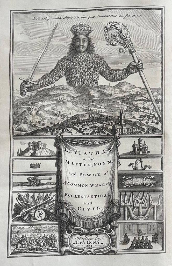
Frontispieces were illustrations that accompanied the title pages of books, often with the aim of distilling the book’s central theses into one image.
A famously entrancing example appears in Thomas Hobbes’ ‘Leviathan’, which carries the cumbersome alternative title:
The Matter, Forme and Power of a Commonwealth Ecclesiasticall and Civil
So let’s stick with just ‘Leviathan’, shall we?
The frontispiece looked rather a lot like this:
This is hi, tech., not hi, hobbes., so I’ll keep this bit succinct:
If you look at the terrifying figure of the giant monarch, representing the Leviathan of the state, you’ll see that he’s made up of tiny people. These subjects must work together to ensure the functioning of the state; they could try to walk away, but if they did, the whole system collapses.
“For it is the unity of the representer, not the unity of the represented, that maketh the person one… And if the representative consist of many men, the voyce of the greater number, must be considered as the voyce of them all.” You get the idea.
So that was one of Hobbes’ key points in the work and the image sums it up neatly, albeit creepily.
There are lots of other symbols and codes within the image, but that’ll do for our purposes.
Hobbes didn’t draw the image - a French artist called Abraham Bosse tackled that - but he did collaborate with the artist to make sure it was in line with the book’s theories.
Frontispieces were expensive to create but their eye-catching nature could lead to a dramatic surge in sales.
Which brings me to today’s big questions:
Why don’t we create these images any more?
In fact, why don’t we try drawing them ourselves?
Sure, literacy rates are higher today than they were back in the 17th century. But we are still highly visual creatures, addicted to the copycat aesthetic on Instagram and TikTok.
I know why I don’t draw, to be fair. My best efforts would rank alongside those of the Arsenal manager Mikel Arteta, who designed this masterpiece to motivate his squad:

But even crude drawings are effective. They are authentic and unique, if nothing else.
The benefits for the drawer are legion:
It increases creativity1 and forges new neural connections, as we work through the kinks in our ideas by drawing.
Yet this same study finds “both art education and scientific literacy remain at an inadequate level even in economically advanced countries.”
It reckons that the two are connected and that the arts and sciences would both benefit by bringing scientific ideas to life through visual arts.
It commands the attention of the audience.
If you’ve never jumped up in a meeting, grabbed the pen, and started drawing a concept on the board, you haven’t lived.
In enhances our understanding.
You can fudge a concept with written language. Trust me. To draw it, you need to have a clear picture in mind.
You can get better at it through practice.
Just this week, I saw this article: I used to think art required natural talent. Then I taught myself to draw
Since I have the artistic nous of a pig in a trough, I work on a small set of concepts and frameworks I can draw at a moment’s notice. Oh sure, it looks spontaneous in the meeting, but people don’t see the minutes of practice behind those scrawls.
Anecdotally, I know that audiences do crave this information format.
I worked on a digital disruption course and a colleague attempted to summarise the whole course into one, hand-drawn image. He did a good job of it, to give him his credit, but people went crazy for that doodle. It doesn’t replace the months of work that preceded it; rather it is a useful complement.
The same applies to more professional efforts. The courses that contain clear, visual frameworks are always very well received. The problem is that very few courses have their own, unique templates and frameworks.
There are, to my mind, a few reasons why we are reluctant to meet this demand:
Drawing is something childlike that we dismiss, as though pure reason were the evolutionary destination and imagination a mere stopping post on the journey. We have access to so many tools that can smooth out the edges for us, failing to realise that value resides in those very imperfections.
It entails risk. There is a vulnerability to putting our own ideas into a picture. Where examples and case studies can let the audience’s minds fill in the blanks, a visual representation seizes the narrative.
It’s harder than it looks. Business books, in particular, are effective in their use of cold diagrams to communicate concepts. That caters to part of our minds; to go further would require an artistic sensibility that many struggle to stir.
We should have the technology at our disposal to create new images. I can’t be alone in thinking that a frontispiece, à la Hobbes, would greatly benefit any number of business books.
So I asked DALL-E 2 to give me a hand.
I sent it a summary of my key points from this newsletter and it came up with this:

Maybe I’d have been better off drawing it myself.
https://www.ncbi.nlm.nih.gov/pmc/articles/PMC3274761/